Heritage Meets Modernity


Pentagram’s updated branding for Guggenheim unifies its global museum network, highlighting each location equally, including the upcoming Abu Dhabi branch. The new wordmark is sleek and timeless, the color palette adapts well to different exhibitions, and the custom iconography ties it all together. While the design is polished and versatile, the abstract icon meant to represent the museum network feels a bit out of place. The branding is a safe, natural evolution that balances heritage and modernity, but it lacks the originality to truly stand out.
Image Credits: Pentagram
Creative Concept (15%)
Reading their case study, Pentagram and their team wanted to redefine Guggenheim as a "constellation of museums" rather than a system with one main hub. Since the first Guggenheim museum opened in New York in 1939, the institution has expanded globally to places like Bilbao, Venice, and soon Abu Dhabi in 2026. The new branding needed to unify these locations under one cohesive identity, giving equal importance to all branches. To achieve this, they introduced a refined wordmark, a standalone icon, and a naming system that ties the museum names to the logo. While the effort and concept is thoughtful, the execution feels a bit short on originality.

Taste & Culture (15%)
For art lovers, this new identity is clean, crafted, and feels intentional. With the Abu Dhabi branch about to open, Guggenheim is set to become an even bigger cultural icon. The identity’s flexible color palette can adapt to different exhibitions, almost acting like a blank canvas that shifts to complement the latest art pieces.

Evolution (15%)
Guggenheim’s branding has gone through a few notable redesigns. Legendary designer Massimo Vignelli referenced the New York museum’s spiral architecture in 1982. In 1997, Abbot Miller’s redesign introduced a dark blue palette and serif type. By 2013, Pentagram brought in a modern black-and-white look with an all-caps wordmark and a distinct “G.” Now in 2024, with Abu Dhabi on the horizon, Pentagram has updated their own 2013 work, streamlining the branding for a global presence. While the frequent rebrands can feel like overkill, the stylized “G” and all-caps logo have become synonymous with Guggenheim, and this latest evolution fits the brand’s forward momentum.

Level of Polish (10%)
Pentagram collaborated closely with Guggenheim’s internal design team, delivering a cohesive brand system. The custom iconography and wayfinding symbols, inspired by the angles in the wordmark, are particularly impressive. The use of Swiss grid elements, like horizontal lines framing content, adds a refined touch. However, the abstracted icon feels disconnected from the tall, sleek look of the rest of the identity.

Originality (15%)
The grids, color palettes, wayfinding system, and dynamic logo feel familiar for a cultural institution like Guggenheim. Even though nothing here is groundbreaking, the final designs come together beautifully. The icon works well in small formats, like corners of posters or website favicons, where the wordmark can’t fit. Over time, this new icon will likely become a recognizable part of the Guggenheim identity, even if its flat, semi-circle shape feels a bit out of sync with the overall brand.

Brand Fit (20%)
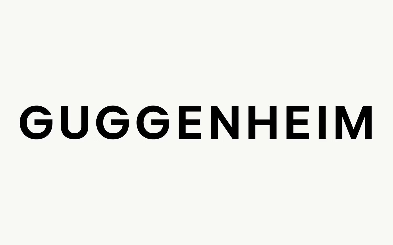
The new wordmark has made it an even prouder, upward-facing stylized “G” — while the icon tries to represent all Guggenheim branches: New York, Bilbao, Venice, and Abu Dhabi. While thoughtful, the abstract “G” feels a bit underwhelming next to the rest of the polished identity.

Timelessness (10%)
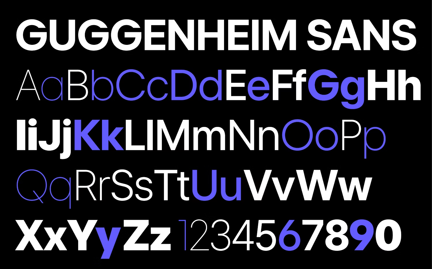
The updated font, a custom redrawn version of Inter, brings a modern yet timeless appeal. Inter is commonly used in digital spaces, giving the brand a trendy yet versatile foundation. It’s geometric and rounded but still works across both digital and physical applications. Paired with Swiss grids, flexible color options, and a large set of custom icons, this branding is built to last while staying adaptable to Guggenheim’s global presence.

The Latest Glow-Ups
Are you stuck at GTM launch without the right branding?
Get started TODAY to launch worry-free in the next 30 days!


